
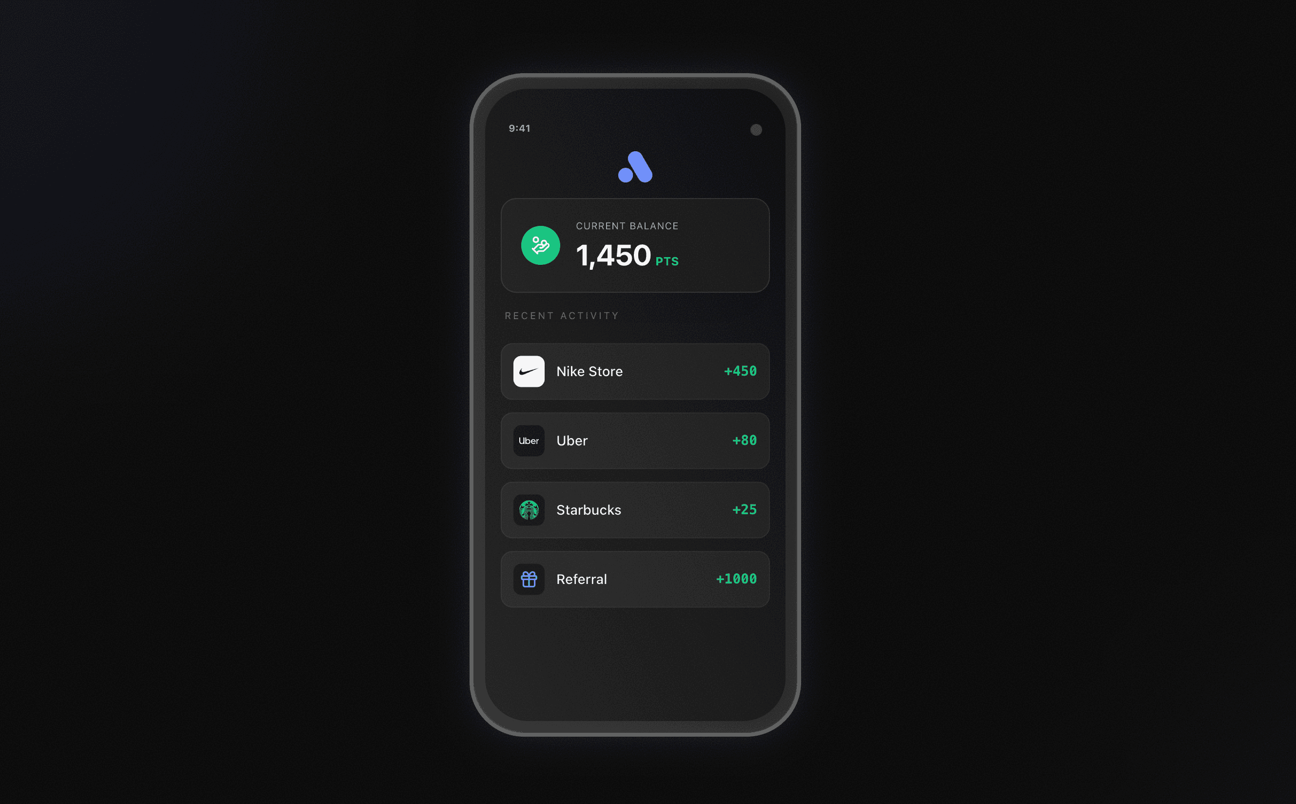
Alora
Consumer rewards platforms default to sterile, transactional interfaces. The design challenge for Alora was to prove that fintech utility tools could carry genuine aesthetic conviction and feel like a premium lifestyle brand without sacrificing trust.
Livealoradesign.vercel.app/Visual Language First
Self-initiated. I owned every decision end to end: product narrative, interaction model, visual language, and component composition, across a full multi-page build (landing, product mechanics, brand story, live email capture).
The build prioritised expressive visual craft over the shared token architecture applied elsewhere in this portfolio: a fine noise-texture overlay and a dark, high-density financial interface, composed directly rather than assembled from a shared token layer. That token pass is the deliberate next iteration, not a gap in the current build's finish.
The dark theme wasn't a stylistic default. It was chosen to test whether the visual language held up under the constraint of a dense, trust-sensitive financial UI.
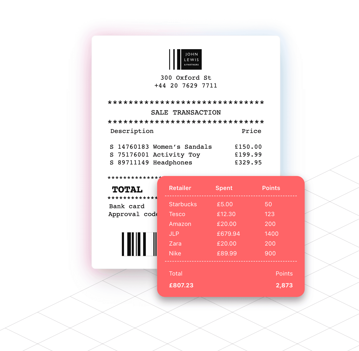
A Complete Product Narrative in Code
A premium fintech product exercise carried through a full site, not a single landing page: an animated hero with a live product mockup, a scroll-driven mechanics section, and a brand-story page arguing the product's actual point of view. Grain and precise micro-interactions throughout.
Scoped as a visual-language and product-narrative build; the next iteration is assembling it onto a shared token layer rather than direct composition.

Effortless Rewards